01The logo overview
Fresh, simple, convenient.
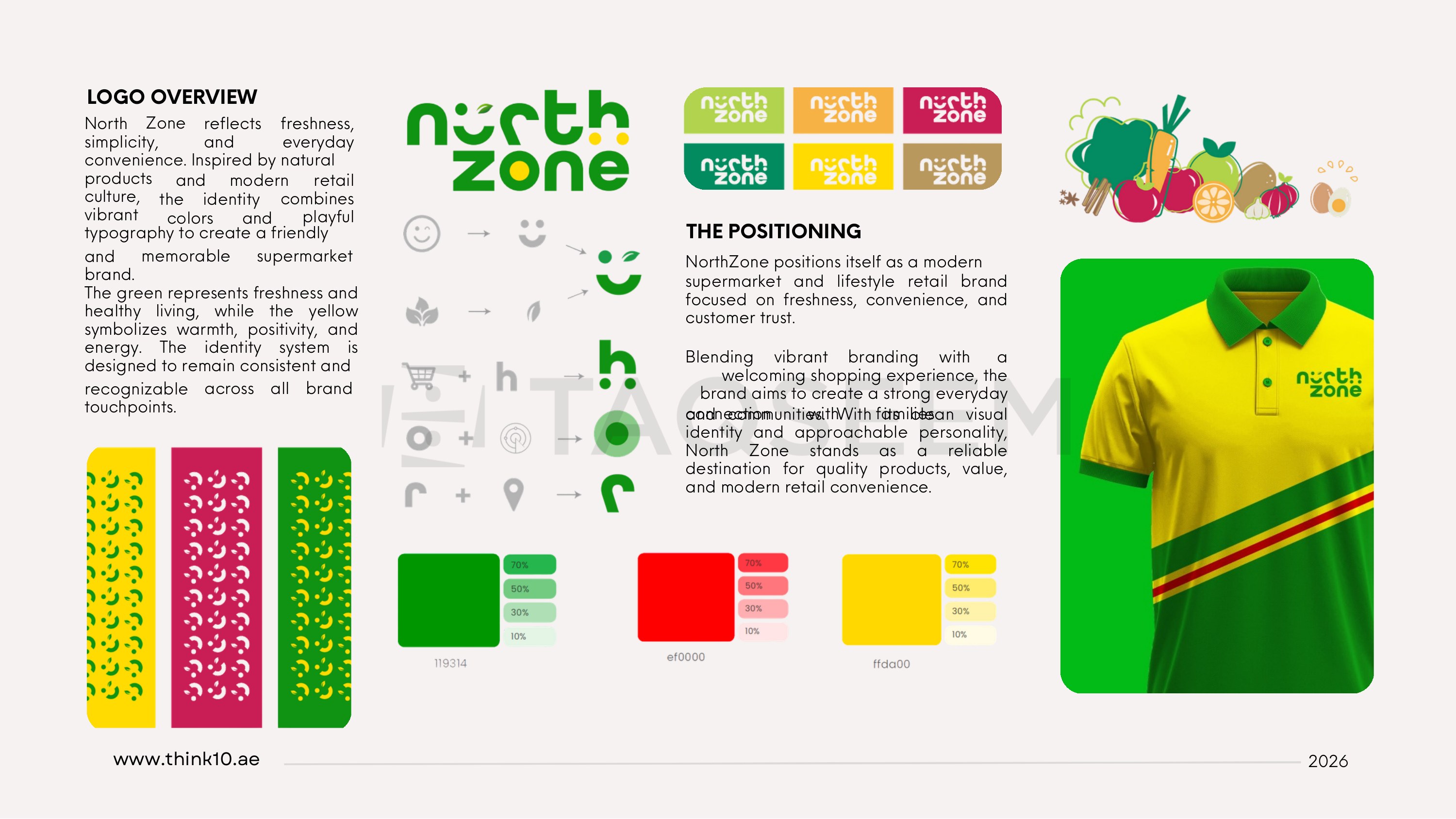
North Zone reflects freshness, simplicity and everyday convenience. Inspired by natural products and modern retail culture, the identity combines vibrant colors and playful typography to create a friendly and memorable supermarket brand.
02The colors
Green for freshness, yellow for warmth.
The green represents freshness and healthy living, while the yellow symbolizes warmth, positivity and energy. The identity system is designed to remain consistent and recognizable across all brand touchpoints.
03The positioning
A modern everyday supermarket.
NorthZone positions itself as a modern supermarket and lifestyle retail brand focused on freshness, convenience and customer trust — blending vibrant branding with a welcoming shopping experience to build a strong everyday connection with families and communities.
04The private label
One smile across every shelf.
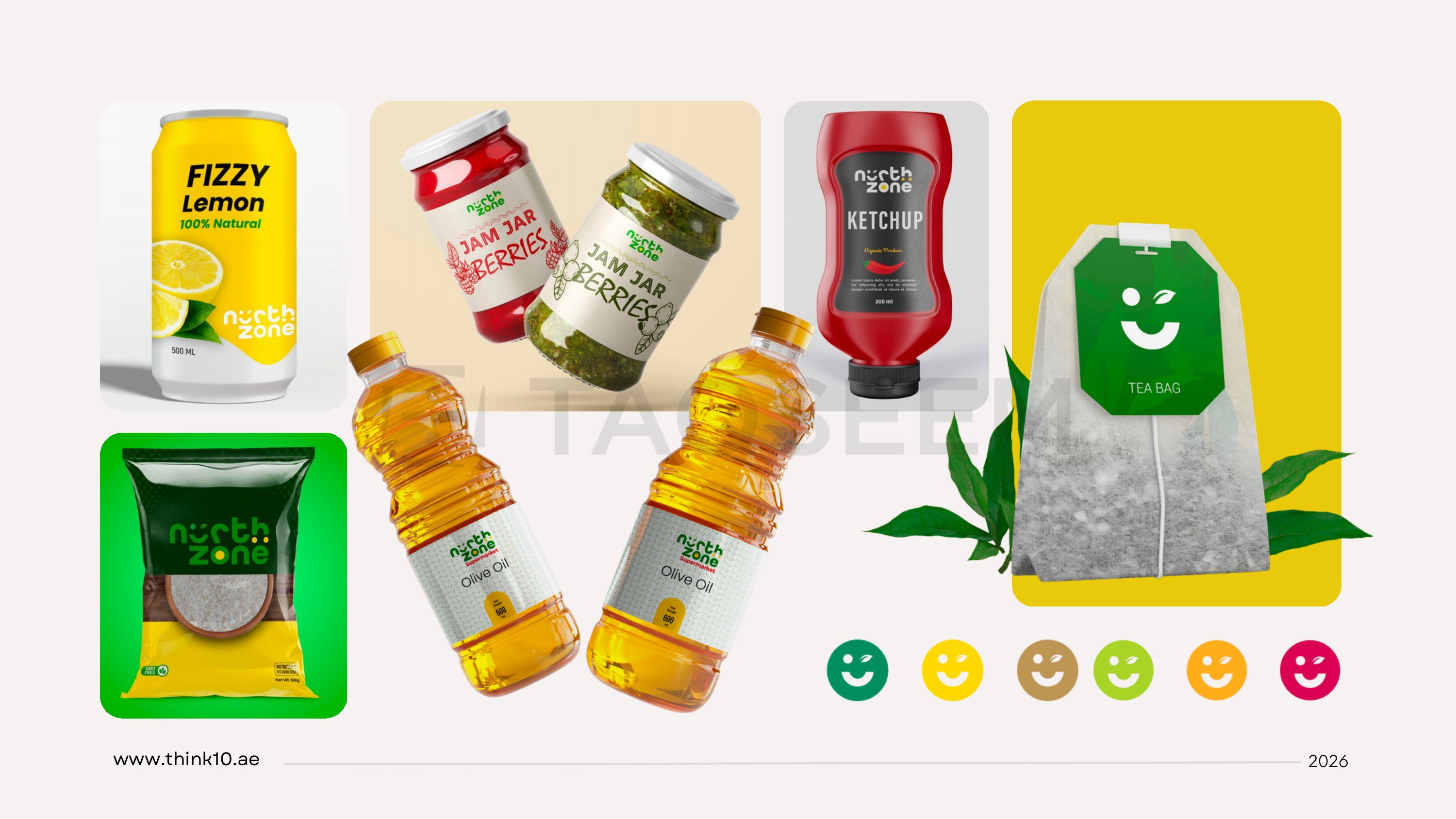
With its clean visual identity and approachable personality, North Zone stands as a reliable destination for quality products and value — carried onto private-label packaging for drinks, jams, ketchup, olive oil, rice and tea, plus staff uniforms.